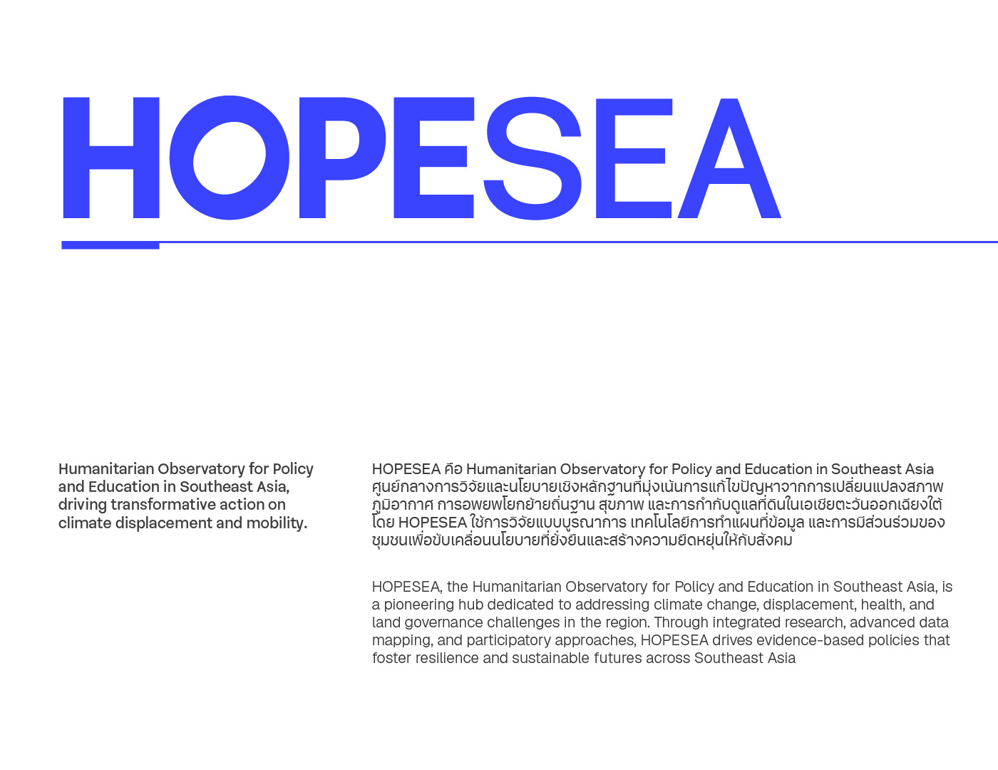
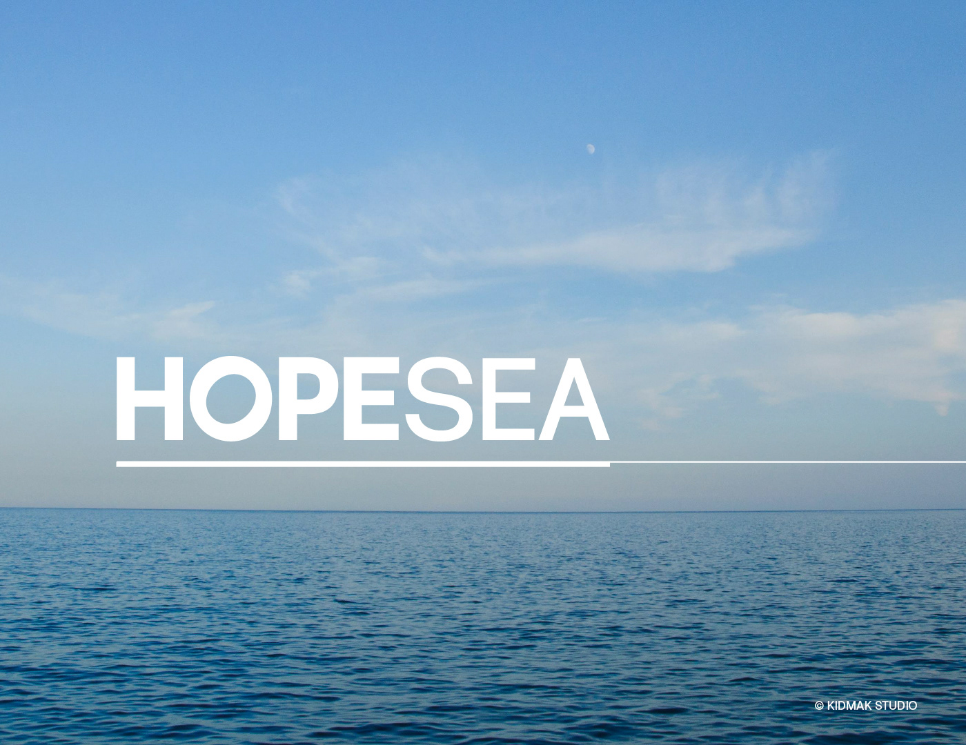
HOPESEA – Hope in the Face of Change
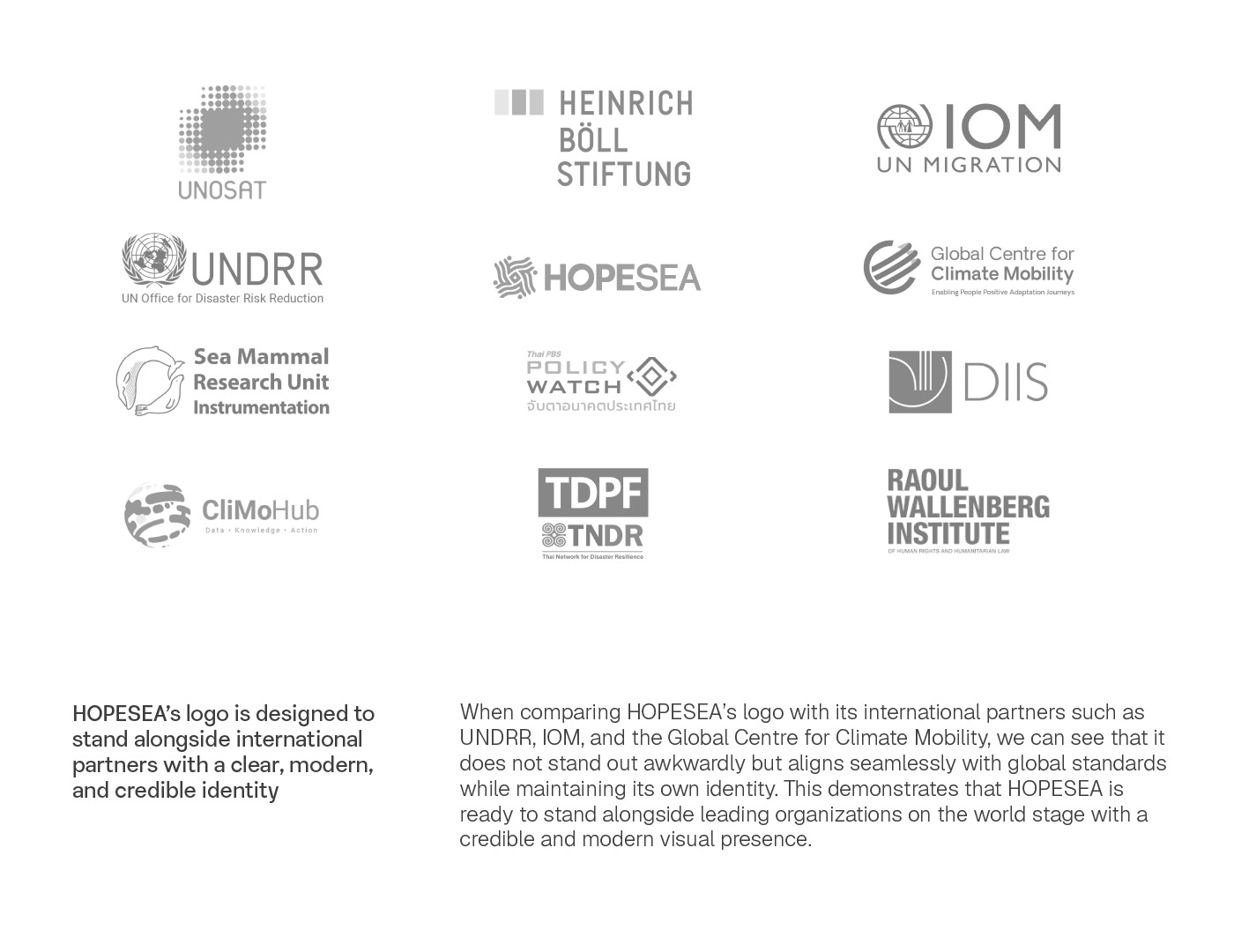
HOPESEA is a project born to address the challenges of climate change in Southeast Asia—one of the most vulnerable regions facing rising sea levels, natural disasters, and shifting environmental conditions. More than just research, HOPESEA is about connection: linking researchers, policymakers, and local communities to co-create actionable solutions and policies.
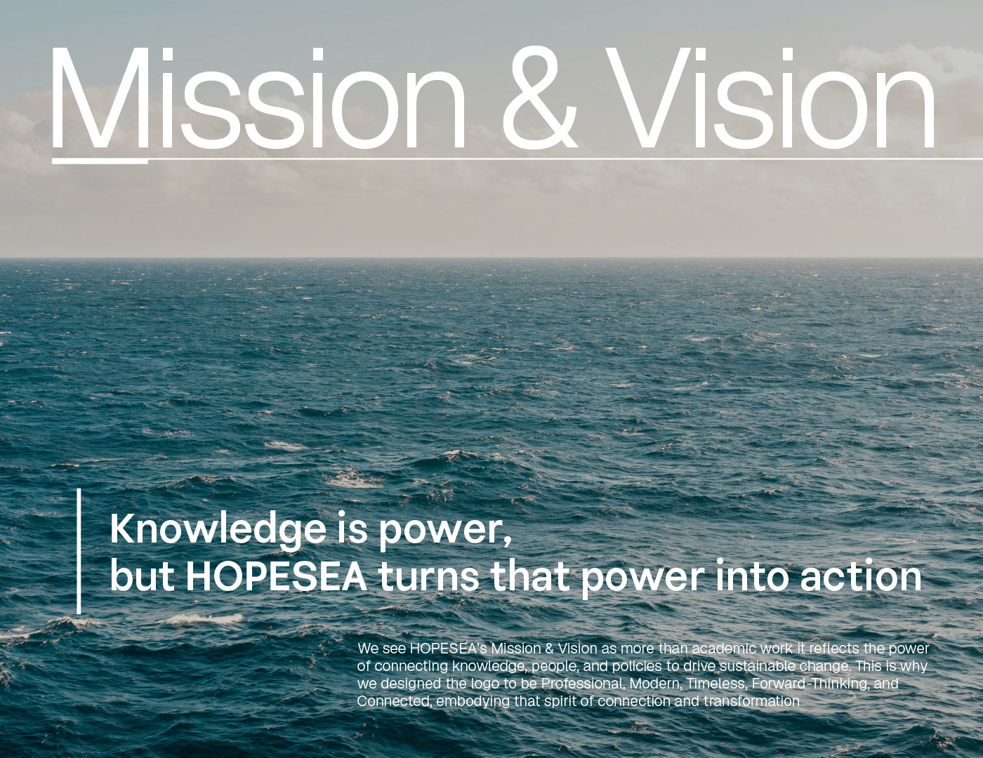
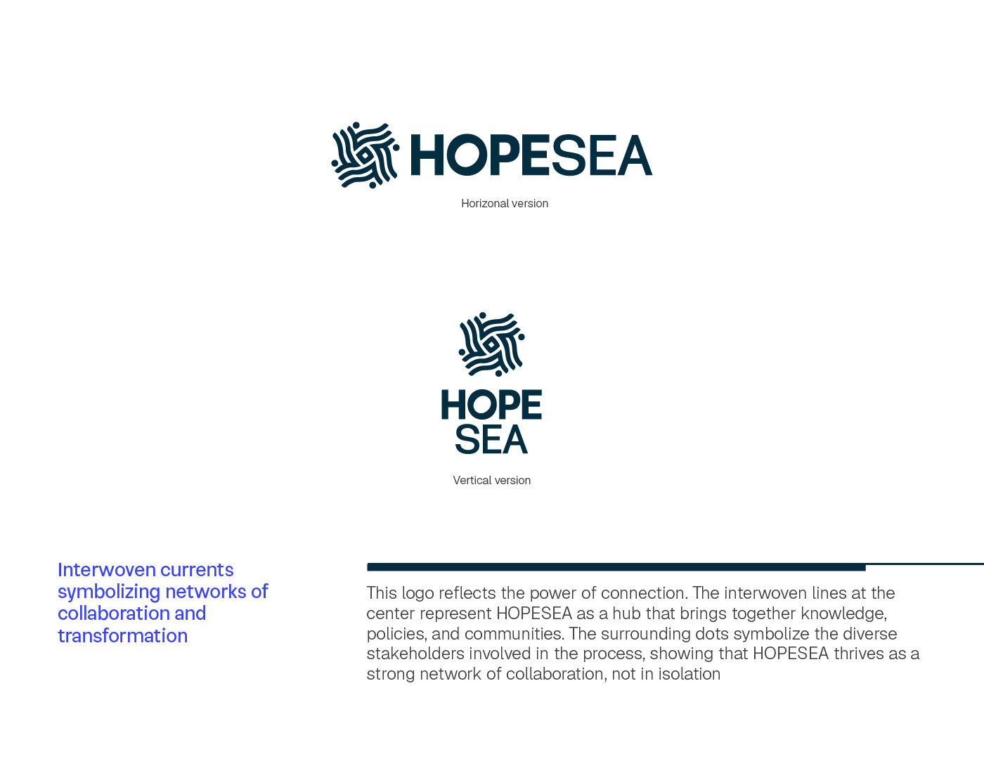
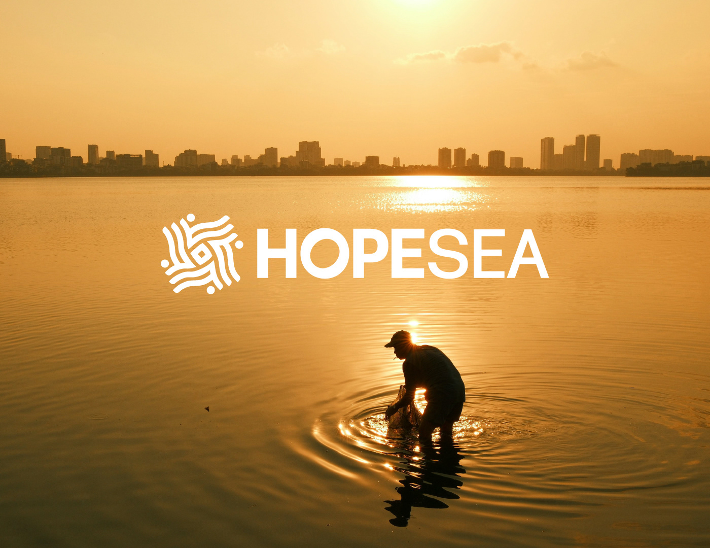
The brand identity of HOPESEA was crafted to embody both “the power of hope” and “the movement of the sea.” The visual language incorporates waves and the sun, symbolizing renewal, resilience, and collaboration. The overall design represents a modern NGO identity—human-centered, trustworthy, and forward-looking.
Design Elements
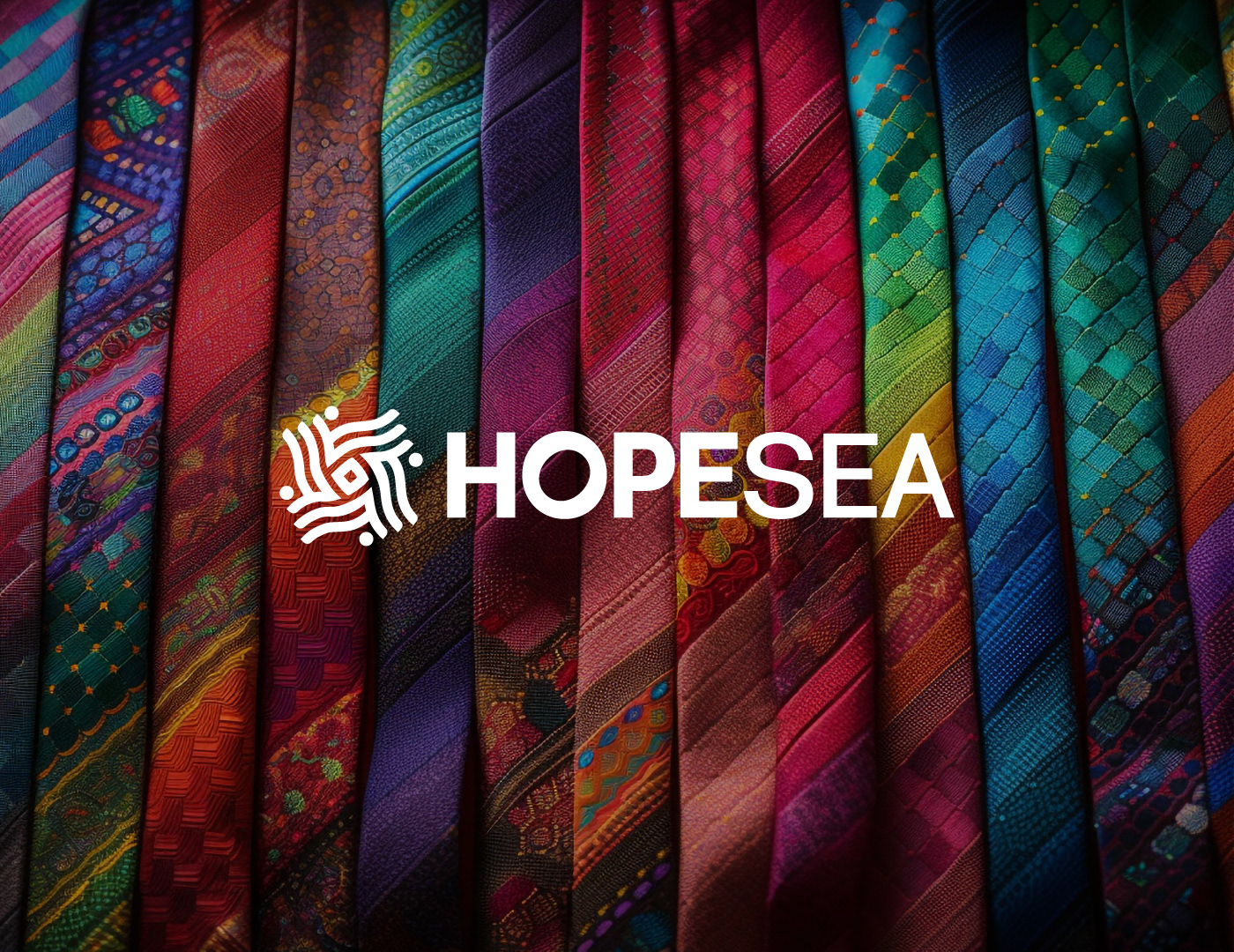
• Logo: Wave and sun motif, symbolizing continuity and transformation.
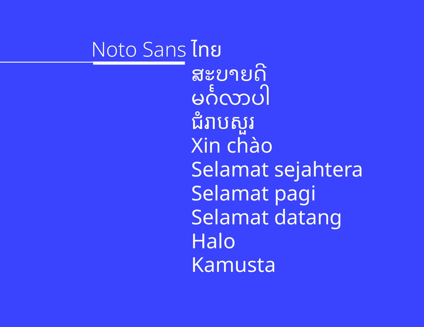
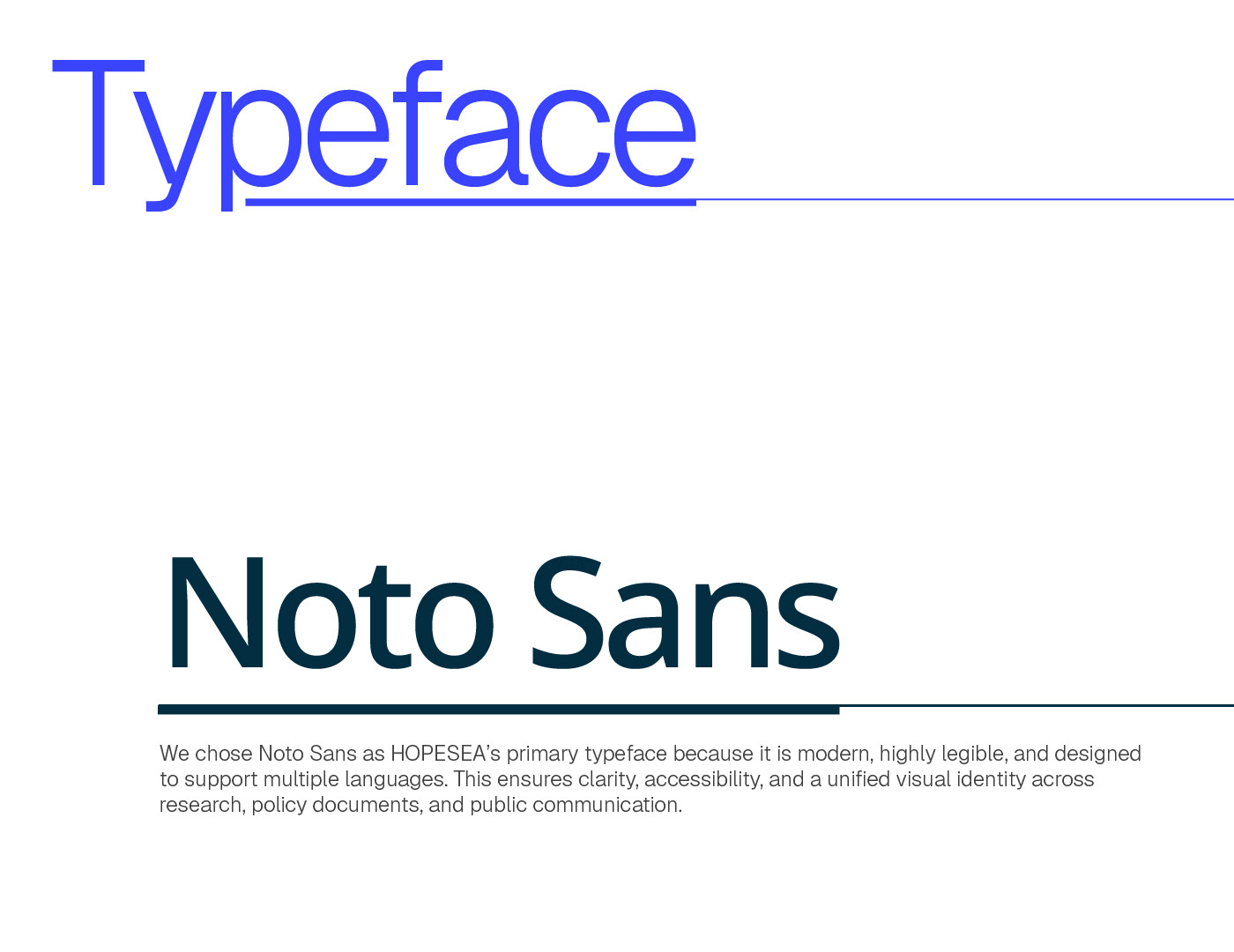
• Typography: Noto Sans, chosen for modern clarity, multilingual support, and accessibility.
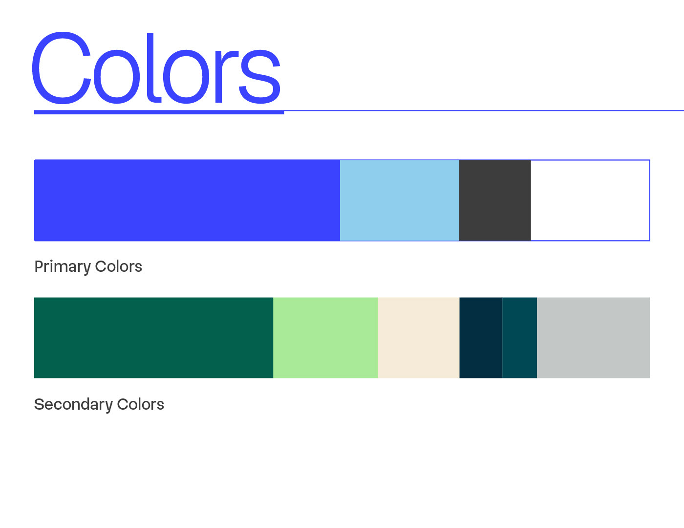
• Visual System: Ocean-inspired blue tones combined with clean whites and deeper shades, representing stability, hope, and openness.
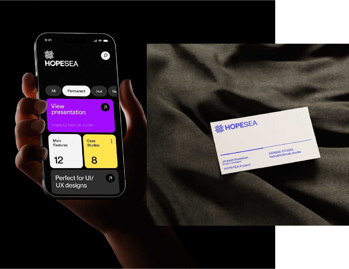
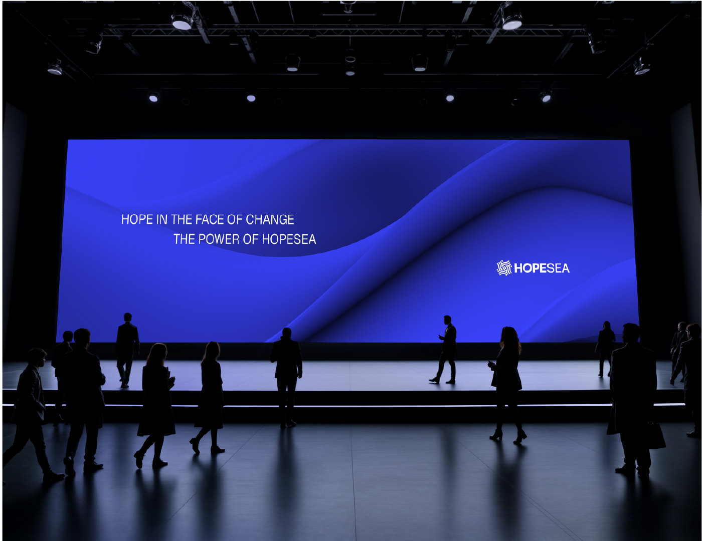
• Applications: The identity extends seamlessly across touchpoints, from speaker passes and business cards to mobile applications, websites, and large-scale presentation visuals.
At its core, HOPESEA stands for “Hope in the Face of Change”—a unifying message that empowers communities to stand resilient against global shifts while working together for a sustainable future.